The Importance of Mobile Optimisation & How to Make Your Website Mobile-Friendly
In today’s digital world, more than half of all internet traffic comes from mobile devices.

If your website isn’t optimised for mobile users, you’re not only providing a poor user experience but also losing potential customers. Google prioritises mobile-friendly websites in its search rankings, making mobile optimisation crucial for SEO, engagement, and conversions. Here’s why mobile optimisation matters and how you can make your website mobile-friendly.
Why Mobile Optimisation is Important
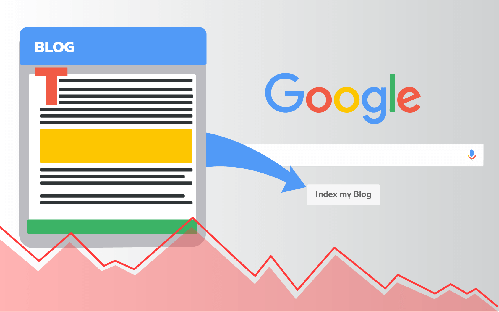
1. Mobile-First Indexing by Google
Google uses mobile-first indexing, meaning it primarily evaluates the mobile version of your website when determining rankings. If your site isn’t mobile-optimised, it could rank lower in search results.
2. Better User Experience (UX)
A mobile-friendly website ensures:
- Faster load times.
- Easy navigation with touch-friendly buttons.
- Readable text without zooming.
- A seamless experience across devices.
A poor mobile experience can lead to high bounce rates and lost customers.
3. Increased Conversions and Sales
Studies show that 74% of mobile users are more likely to return to a site that is mobile-friendly. A well-optimised website ensures a smooth shopping or browsing experience, increasing conversions and sales.
4. Competitive Advantage
Many businesses still struggle with mobile optimisation. Ensuring your website is mobile-friendly gives you
an edge over competitors that haven’t prioritised mobile usability.
How to Make Your Website Mobile-Friendly
1. Use a Responsive Design
A responsive website design automatically adjusts its layout to fit different screen sizes. Most modern website builders (including Appkazoo AI) offer responsive themes. Test your site’s responsiveness with Google’s Mobile-Friendly Test.
2. Improve Page Speed
Fast-loading pages are essential for both SEO and user experience.
Improve speed by:
- Compressing images using tools like TinyPNG or Smush.
- Enabling browser caching to reduce load times for repeat visitors.
- Using a Content Delivery Network (CDN) to distribute content faster globally.
3. Simplify Navigation
Make it easy for users to find what they need:
- Use a hamburger menu for a clutter-free layout.
- Ensure buttons and links are large enough for easy tapping.
- Reduce the number of steps to complete actions (e.g., checkout or sign-up forms).
4. Optimise Content for Mobile
Keep your content concise, scannable, and engaging:
- Use short paragraphs and bullet points.
- Ensure text is readable without zooming.
- Avoid pop-ups that disrupt the user experience.
5. Enable Accelerated Mobile Pages (AMP)
AMP helps web pages load faster on mobile devices. Implementing AMP can improve your SEO and reduce bounce rates, making your website more mobile-friendly.
Final Thoughts
A mobile-optimised website is no longer optional—it’s essential for SEO, user engagement, and conversions. By following these steps, you’ll improve your site’s performance and attract more visitors.
Start optimising today to ensure your website stays ahead in search rankings and delivers an exceptional mobile experience.
BlogKazoo